A Brown Product Management Fellowship capstone project that unifies TransLoc and PassioGo, the two apps behind Brown's shuttle system, into a single app to streamline shuttle information and improve the Brown University student transit experience.
TIMELINE
Oct – Nov 2025
TEAM
3 Product Manager Fellows
ROLE
PM & Lead Designer
TOOLS
Figma, Miro
OVERVIEW
Two shuttle apps, and students trusted neither
Brown's shuttle system runs on two apps that students can't tell apart, so many give up and walk instead. As a PM and lead designer on a three-person capstone team, I turned 24 student interviews into an MVP scope and designed every screen of a unified shuttle app.
THE PROBLEM
A good shuttle system stuck behind two apps
Brown runs fixed routes, a late-night OnCall service, and coverage on campus as well as in the surrounding area, but it all lives in two apps: PassioGo for routes, TransLoc for OnCall, and most students can't tell you which is which. They mix up schedules, stop trusting either app, and end up walking home on the exact winter nights the shuttle exists to prevent.
21 of 24
students interviewed were unsure about which app does what
18
couldn't keep schedules, routes, or service coverage straight
16
didn't trust the live tracking or wait times; reported inaccurate ETAs
a snapshot of THE BEFORE STATE

RESEARCH & DISCOVERY
What 24 students told us
We interviewed 24 Brown students about how they get around campus and where PassioGo and TransLoc lose them. The same four frustrations came up again and again.
Nobody knows which app does what
"I think PassioGo is for routes and TransLoc is for onCall? Or vice versa? I have no clue…"
Schedules are a guessing game
"The schedule doesn't match when I need it and the apps feel like too much work."
The map can't be trusted
"It would say bus coming in 0 minutes but it took much longer to actually show up."
Both apps feel cluttered
"It just felt cluttered. I didn't know if I needed to select something to start or if it was automatic."
"If figuring out how to use it takes too long, I'd rather just walk."
— FROM OUR STUDENT INTERVIEWS
KEY INSIGHT
Students already treat the shuttle as one system, so the answer had to be one app that does both jobs.
Who we designed for
Persona & journey map
Meet Oliver, junior at Brown
Who:
20 y/o, lives off-campus, works at a lab in Brown School of Public Health (20 minute downhill walk!)
Goals:
Get home safely and quickly after shifts, especially during the winter months.
Frustrations:
Never knows which app to use, misses shuttles due to inaccurate timing.
Behaviors:
Checks multiple apps, often walks instead of risking shuttle confusion.
OLIVER'S JOURNEY:


DESIGN PROCESS
How might we…
How might we unify Brown's shuttle services into one app students actually trust? How might we reduce the cognitive load of catching a shuttle?
Deciding what made the first version
The brainstorm produced more than what we could design in six weeks. Sharing a ride with a friend for late-night safety, multi-leg trip planning, and Google Maps style walking-plus-bus directions were all features we wanted. We sorted everything into three tiers and drew the line under the second.
P0
One app for both fixed routes and OnCall, live tracking with ETAs students could trust, and booking with a clear confirmation. Without these there was no reason for the app to exist.
P1
Route toggles and favorites, nearby stops with distances, and service alerts on open. These came straight out of interviews, so they earned their way in.
P2
Ride sharing, multi-leg trip planning, and walking directions. Cut for the first version.
What decided it was validation cost. Every P2 feature added a flow we would have had to put in front of students, and we had more ideas than weeks to verify them in. We instead chose to prioritize the core features of the app.
Wireframes & direction
Research was a team effort, but the design from here was mine. I wanted most tasks to live on one map; stops, routes, and OnCall status are states of a single screen, instead of split across two apps.

A KEY TRADEOFF
Clutter vs. completeness
Both original apps drew every route on the map at once, and it was one of the loudest complaints in our interviews: 13 of 24 students called the UI cluttered. Which routes matter is a personal decision, so I let users draw that line instead. Every route can be toggled on/off, and users can favorite their preferred routes. The cost is a little setup effort up front, which felt like a fair exchange for a map that only shows what you asked for.
FINAL DESIGN
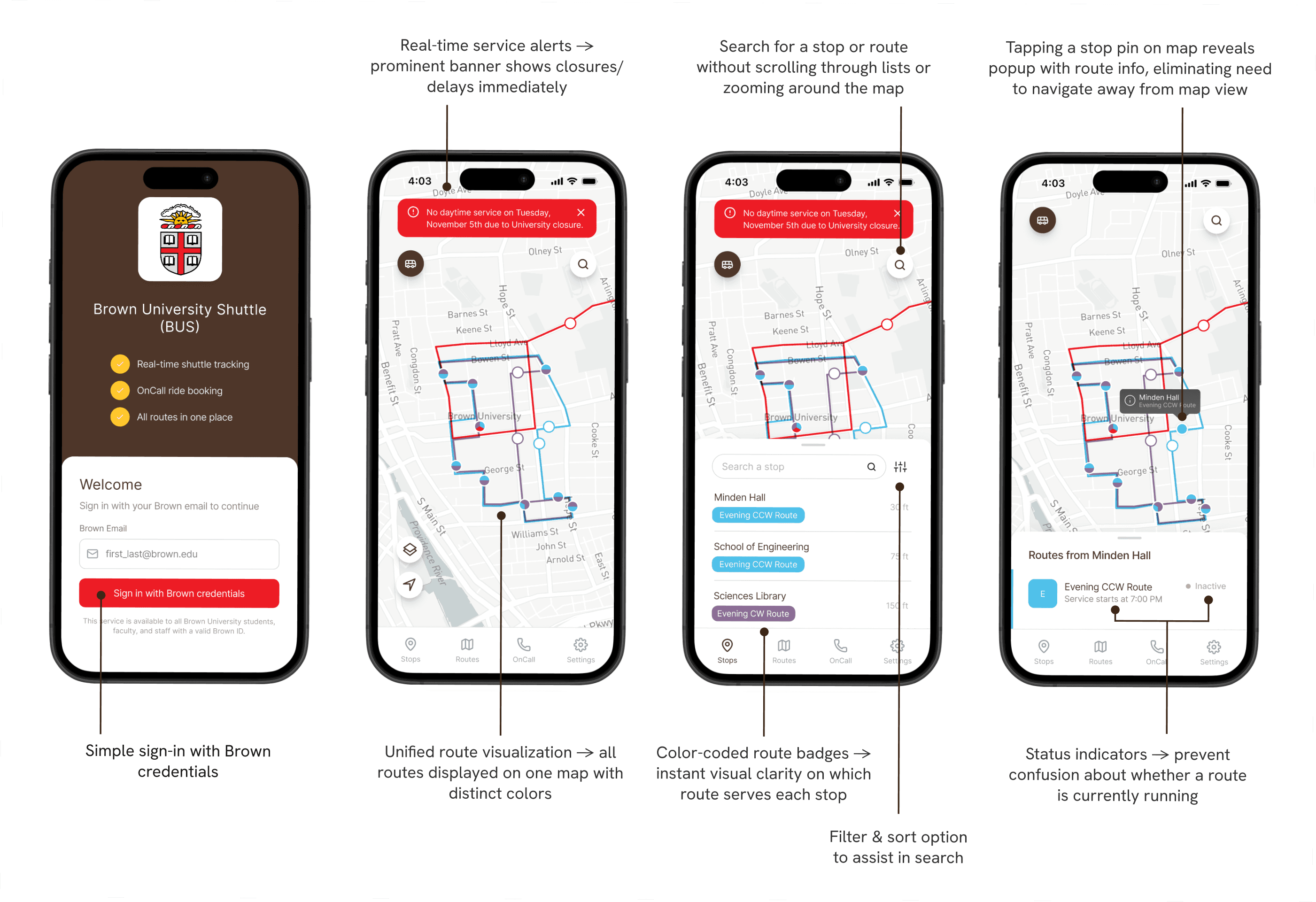
One app for the whole system
Welcome & Stops
I focused on reducing cognitive load from the moment the app opens: students immediately see service alerts, nearby stops with distances, and search. There is no agency selection or setup before any of it, since this app is Brown-specific.
Routes & live tracking
Routes addresses the biggest complaint about the original apps: too much on the map at once. Students toggle routes on and off and favorite the ones they use regularly, and each route shows whether it is active and when service starts.

OnCall booking
OnCall booking is built into the same map instead of living in a separate app. After requesting a ride, students get a clear confirmation with their ETA, bus number, and driver, so there is no wondering whether the request actually went through.

IF THIS SHIPPED
How we'd know it worked
If this app had shipped, the first number I'd watch is how often a student still opens a second app in the same session, because that single behavior is what the whole design exists to remove. After that, the ratio of app opens to completed rides, which shows whether people who check the app actually catch the shuttle instead of giving up and walking, and app store reviews + student-surveys as the slowest but most direct read on whether students trust it.
REFLECTIONS
What I learned, and where I'd take it next
I came into this project thinking of it as a simple UI refresh, but the interviews proved me wrong. Students had gotten so used to the confusion that most didn't call it a problem until they heard themselves describe it. Watching that happen across 24 conversations is what sold me on research-first product work, and on personas as a way to keep all of it in view while designing.
If we took this further
The capstone ended with our presentation to the Brown Product Management club, and the design was never rolled out. If we took it further, the first step would be usability testing with students: the design feels clean to our team and peers we informally tested with, but the real test is whether it is actually better than the old system for someone trying to catch a shuttle.